Thursday, August 27, 2009

Another forgotten Spanish gem on Broadway...


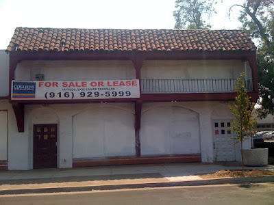
Not but a hop, skip and jump away from the Moorish Sterling Cleaner's building is the now defunct Monterrey style remnants attached to what used to be the Ring Up Rivet carpet company. Operating since at least the 1880's (!!!) and all the way into the late 1990's, this not so little Spanish Colonial structure sits on a large Broadway lot right off 24th Street. You may have seen it while driving by at 25 or 30 miles an hour which means you missed some of the little things that make it a structure worth rehabilitating. Let's start from the ground and move up.


Running from the edge of the sidewalk to the base of the building are large adobe red tiles. About 12x12 in size they run a little more than 3 deep and 24 wide. Already in good condition, with a little love I bet they would polish up to a high shine.


Running along the base of the inset and painted over window arches are several rows of tile. Rectangular black tiles form a single row along the ground with a dual square row of terracotta colored tiles in the middle. Just above that is a narrow, rectangular setting of geometric curved x's and o's. The two v's that make the x like shape are navy blue and the o's are a creamy yellow color with a red/orange terracotta center. All I can think of are egg yolks...but maybe they are shapes to make ya' think of rivets! The coolest part about these tiles is they have a lifted texture like a relief map. Above these oddly length rectangular tiles is one more single row of terracotta tiles. Unfortunately, a poorly done paint job has left splatter strewn across many of these pieces (and on much of the rest of the surface of the building) though a careful cleaning could likely clean them up as well.


The two massive doors must be original as the white one below still has the period hardware on it as you will see in the photo further on. Inset arched windows and an overhanging balcony with hand worked ads elements give the building its overall Monterrey ranch flavor.


Below you can see the turned wrought iron balcony and carved wooden brace elements. Also notice the beveled wood end caps a lovely decorative touch.


I would guess that much of the Spanish Colonial Revival architectural elements are purely facade considering the age of the Ring Up Rivet company and the structural views from the side of the building .


Looking closely at the little details may have ended up being the most pleasurable for me. Better than the tile was the original handle and lock hardware I found! Covered in paint and needing a serious soaking I recognized this hardware from one of the rectory buildings near the old St. Luke's hospital on Capitol Avenue.


You can see from the comparison that the handles are exactly the same and the locks are slightly different in their bases. However if you look even closer you can see that the lock and handle bases appear as though they may have been interchangeable as the clean hardware handle base matches the dirty hardware lock base in shape. I'm thinking these have got to be from the same period producer and wondering if they were local.


If I had the power to re-enliven this building I would turn this space into a hustle and bustle night club...NO DOUBT! With this great neon sign and wide open floor plan, let alone minimal neighborhood concerns for sound complaints.

Monday, August 24, 2009

Spanish reflections on the Broadway Corridor


Out on the Northeast end of 24th Street and Broadway sits the Sterling Cleaner's building, a unique example of Spanish Eclectic architecture on the Broadway commercial corridor near the Curtis and Land Park neighborhoods. Just down the street* from both Sierra School (now Sierra II) and the Tower Theater, Sterling Cleaner's has been partially rebuilt from an arson that took place in the late 1990's. I believe that the outer walls of the building, upper industrial windows, mid beams and tiles are still original. I also have a faint recollection of large light-bringing picture frame front windows and a squeaking front door... but I am not sure if my memories are accurate as I have not been able to find any pre-fire pictures of the front of the building online.


Here you can see the lofty industrial windows and the dual mid-beams that denote the split between the dry cleaner's and the cafe business (now there) into two separate establishments. As I recall from my childhood though, I think the building used to house only the Sterling Cleaners itself as a total whole. Thankfully, the bones of the structure were protected from demolition, as they represent not only a piece of neighborhood historical architecture but also quite a few girlhood memories for me. (Not that the large vinyl hanging signs do much for the exterior aesthetics either... good to know FAX is still an important form of communication in 2009.)


I totally remember my mom being upset at the thought of the building being torn down and replaced with some box mall building after the fire. As a self proclaimed "tile freak" she didn't want the structure itself to go, though interestingly she didn't remember whether the tile on the facade was original or not. You can see the basic chevron type pattern above. This is unique as compared to other tile patterns around the area. The tile is repeated across the front of the building with the sea green tile top-ends and peach colored pieces of varying shades also extending to the base of the structure.


I have many a memory of the weekly trip's to Sterling, cruising in my mom's blue '80 Mercedes after being picked up from Brookfield School. Less interested in the Spanish Colonial architecture at the time and far more interested in the penny gum ball machine (or was it a dime machine) inside the front door. I do remember standing outside...being fascinated with the dual triangular like tower chimney tops that I can now see speak to the geometric pattern of the tile. I suppose in the end... this building just has a different feel than many of the other Spanish Colonial Revival businesses and residences in town and that is why I remember it....the square shape, the dualities, the geometric nature... all of it feels a bit more Moorish in tone.


* Mind you...the Sterling Cleaners sits next to a modern Taco Bell...however...this used to be an awesome vintage Taco Bell in a 1960's mission style architecture...complete with multi-colored flashing sombrero sign, mission bell and fire pit.

Sunday, August 2, 2009

Out and about in Midtown: The Villa Marquise


I was walking to Michelangelo's Italian Restaurant the other day with K enjoying the night time Summer air when I spotted this little joint on 17th between H and I. In all my years living in midtown I had never noticed the Villa Marquise before!


It appears to be a two story enclosed apartment complex with some of the telltale Spanish Colonial Revival details I love... including a cute little shuttered balcony, built in flower pot holders, wrought iron railings and an archway with carved column's. Although the columns are narrower and faux...more of an afterthought as compared to other properties.


There are also a few iron-style lantern pieces...though these are sparse and not with the same amount of filigree typical of authentic period pieces. I almost get the feeling the original pieces have been removed and replaced with shoddy down market pieces..maybe an unfortunate choice of a new landlord.*


In fact the whole complex feels a bit more like a Mediterranean Italian or French** revival style rather than Mediterranean Spanish.. particularly because of the High-Style elaboration around the edges as seen above.


The one bit that sways me more towards Spanish Colonial Revival architecture is the brilliantly colored Catalina type tiles. Beginning at the locked alcove to the building is a lovely continuous inlay of small art tile pieces and larger adobe red tiles.


These also repeat once inside on the entrance steps.


But best of all are the few narrow repeating tiles along the outer edge of the entrance steps. Look at the bright oranges and gold's and how they contrast with the aqua blues and navy's. Gorgeous!


I love finding these little gems! I can only imagine (and hope) that there are as equally delightful tiles inside these little apartments!


* For those of you looking for a new pad...a review of the apartment complex from 2004.

** Apparently (according to Wiki) a Marquise is a French noblewoman ranked higher than a countess but lower than a Duchess...the wife of a Marquis.

Tile Spotting in Pescadero


I was in Pescadero last weekend and spotted these lovely hand painted tiles mounted on a patio wall outside a retreat center I visited.


Though terrible mounted in cement (ugh) I think they could be Catalina tiles. Or are at least representative of the California Art Tile movement.


The above tile might just be my favorite of the two geometric one's. I am a real sucker for the sea foam color.


Standing alone these tiles make less of an impact...clustered together (as typically mounted) they are far more striking!

Wednesday, July 22, 2009

So fresh and so clean.


Found this sweet little gem while scouring the Sacramento Archives online data base. Shot from the East side of Plaza Cervantes (aka Metro Park) looking towards the future Junior College Soda Fountain, now Espresso Metro.

Across Freeport Boulevard in the distance you can see the large low slung billboard advertising the upcoming Wright and Kimbrough Tract development and the beginnings of the Brockway Court Mansions.

It kills me how small the trees are. I wonder how many are original?

Monday, July 20, 2009

Vintage ad's of Spanish Town.


Long before the rest was here there was the idea of Spanish Town. Note that Freeport Boulevard is still called 21st Street and in parenthesis we have the "Victory Highway". This was established after World War I in memory of those who were lost to The Great War.


The home on the right is on 11th avenue. Called the "Casita de la Fuenta" or The Little House of the Fountain it's got a fantastic stained glass front window piece, possible the only one in Spanish Town. I am not sure if it is original or not. Note also the wrought iron window coverings.


The top home is again the one on 11th avenue. The lower one is on 9th avenue. Notice the double arched garage doors. Both homes were a part of the larger Better Homes Movement spanning the country in the later 1920's.


Here is another shot of the lower home on 9th avenue, called the Pasadena. Apparently, a few years back, the current homeowners were digging in their front yard and found the remnants of the vintage fountain's talked about in the advertisement. Total envy!


The current home of Espresso Metro, The Sandwich Spot and SBX Bookstore. A great line drawing of the business. Notice the vintage fixtures mounted on the outside and curtain bars with curtains for the upper balcony windows. I wonder what color they were.


Pictures provided by Ms. Joan via Dan Murphy and Sierra2.org.

I have tile envy.


We're lucky to own a house at all in these tough times, let alone a pretty little Spanish Colonial Casita like ours. However, I will admit that I drool for the Catalina style tile work that is far more common in the fancier Casa Grandes found up the street and in other parts of Sacramento..as our home was not built with much except for what's left in the kitchen and bathroom. Though, I do wonder if our fireplace used to have such tiles as well....


These pictures are from the front of the Espresso Metro complex on 11th avenue and Freeport and are typical of the California Art Tiles around Sacramento. I particularly love the narrow rectangular bordering tiles on the top and bottom.


For me it's not just the Moorish style pattern's referenced in the design that I love so much...it's also the often bright and rare color combinations used in the ceramics. The tiles also follow a general geometric theme throughout that reverses in shapes and colors or repeats. The tiles above are the only one's in the Espresso Metro complex that are reproductions. According to Ms. Joan, owner of Metro she hand picked the tile and border pattern by request from the owner. Apparently the previous tiles were damaged beyond repair. Ugh! I wish I had an original picture of these...someone somewhere must!


I am pretty sure my predilection for tile work likely grew out of my childhood exploration of Sierra 2 (a.k.a running through the halls and torturing Dan the Janitor with the other neighborhood brats) which has one of the most beautiful displays of California Art Tile in Sac.

But even before that was the cool red tile floor in my parents Heilbron Oaks dining room. I used to lay on that floor and color in the heat of the Summer as a child and then as a teenager, chat on the cordless phone late into the Summer night air.


In researching this blog post I came across an awesome chunk of research done by Erik Fay and Dan Murphy on Curtis Park art tiles. Read this brief history and check out the lovely slide show they put together.